How do you take an age-old message and spin it in a way that people will notice?
It’s a difficult thing, said Aasman Design director Margriet Aasman.
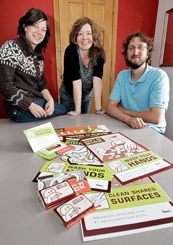
Last year, the company was approached by Health and Social Services to create a campaign around hand-washing and germs.
It’s something that’s hammered into people’s heads starting when they’re only a couple of years old.
Aasman needed a creative hook to turn people’s attention to the message again.
So they focused on humour.
The result landed them two awards from the Canadian Design Edge Regional Awards last month in Toronto.
“The award means our campaign made a difference,” said Aasman. “People acknowledged that it’s innovative and successful.”
The campaign featured a “sickly but lovable” character named Melvin who we see sneezing and coughing and touching communal phones, video games and food with his unwashed hand.
The tag line for each scenario was “Don’t be Sick.” It was a clever play on words, said graphic designer Eleanor Rosenberg.
“It means don’t be gross, but it also means don’t be ill.”
The humorous undertone means people will see the message and remember it.
Days after the campaign was launched, the image had already been spoofed by cartoonist Wyatt Tremblay in the Yukon News.
Then Rosenberg saw someone dressed up as a spotted, green elbow at a Halloween party.
The costume riffed on the campaign message: sneeze into your elbow, not into your hand.
“People even used the campaign in their comedy routines,” she said.
“Because the message was so simple it really connected with people.”
The campaign was supposed to come out just in time for the cold and flu season. Then the H1N1 scare hit and the message became that much more relevant.
The campaign ran on store windows, bus shelters, tissue packages, posters and even Tim Hortons tray liners.
To make a campaign effective, you have to target it at one specific person, said Aasman.
So the trio of designers created a fictitious 38-year-old woman to target the campaign at. She has kids and takes care of her elderly parents. Her husband is a bit negligent and her children are bringing germs home. And when she gets hit with an illness she doesn’t slow down and maybe doesn’t take the time to wash her hands, said Aasman.
It may seem overly specific, but targeted campaigning works, said Aasman.
“The campaign has a more focused look and feel and it doesn’t water down the message,” she said.
Aasman’s campaign beat advertisers throughout the Yukon and British Columbia, snagging them two awards in the outdoor advertising and print advertising categories. They were also listed as a finalist in the logo category for an “identity design” they created for the Old Log Church Museum.
It’s the first time the leading magazine has hosted design awards for illustrators and photographers across the country. The magazine will be publishing Aasman’s campaign, along with other winners, in the upcoming issue of Design Edge.
“It’s quite prestigious to be named a winner,” said Aasman. “It means we’re on par with the bigger agencies down south.”
But the thing that shows the campaign was really a success is that it created lasting behaviour changes, said Aasman.
“Months later we still see Yukoners sneezing into their elbows.”
Contact Vivian Belik at
vivianb@yukon-news.com